Friday, October 27, 2017
Search Filters
Library management apps have a long way to go before they are branded professional. Search algorithms used in such apps are still medium grade.
Take a look. English as a string is recognized differently based on type case.
No good at all!
Thursday, October 26, 2017
Price Drops on Ads
Ads are mostly useless. If they were useful, they wouldn't be called ads. Few ads are useful.
The myntra ad doesn't just tell me to buy the product, but also says that there is a price drop.
A step ahead from here is to even show the price drop and the new price. It that too hard to show?
Not at all.
Wednesday, October 25, 2017
Tuesday, October 24, 2017
What's New in iOS 11
What's New is a feature many mobile developers struggle with. Some create splash screens, some others create tutorials, some create new onboarding screens and some even create longish videos.
Apple is not one of them. They place What's New features right when the user uses that feature or a related feature that is gifted with a better experience.
What's New on Your App?
Monday, October 23, 2017
You are Offline
"You are offline" is a message you don't want to hear while performing an important task. Most apps reach a vegatative state in offline mode.
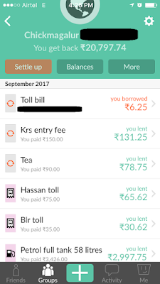
Split Wise is not one of them. When the user is offline, it stores the expenses locally and indicates to the user that it will be synced when the device is back online with a working internet connection.
Is your app alive during offline mode?
Friday, October 20, 2017
App Re-direction?
You are using an app. You want to close it. You close it.
When you close the app, the app threatens to open another site?
Wouldn't you love such an app?
Thursday, October 19, 2017
Blurred Dialogs
When you update a blog post on Linked In, a confirmation dialog appears.
And this conversational dialog is blurred.
Is it of any use?
Wednesday, October 18, 2017
Tuesday, October 17, 2017
Two Level PIN
Two-factor authentication is secure.
Air India wants you two-factor PIN at one shot.
Do you like it?
Monday, October 16, 2017
Chatbots arent' Chatting Smart
Chatbots are cool. But, hey! Where is the conversation?
Talk to a chatbot in a different context and the bot wanders.
Friday, October 13, 2017
Seatmap Legends
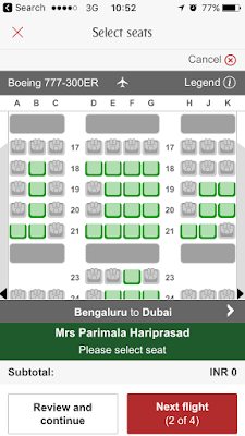
Long haul flights can be tiring. The least thing you expect is a good seat with comfortable leg space. Few airlines offer you the luxury of selecting your own seat. Seatmap may look like this:
Can you identify which seats are available and which ones are occupied. Do you know which ones are paid and which are free? How about knowing which seats have extra leg space for a small fee? Oh! Where are the exit row seats? Does the seat have speaker, phone charging and USB points?
Much of the seat information is not available. Oh, wait! Do you notice the 'i' icon in right top corner? May be, that icon has the information.
But then, shouldn't that information be available without a few taps?
Thursday, October 12, 2017
Passport Details Entry vs. Passport Scan
You are traveling to a new country. You may need a passport with visa. You book your flight tickets. You enter passport details. This is how it looks:
You are traveling with 5 other family members. You have to fill this form 6 times.
Can we simplify this? Yes.
How? By including Passport Scan feature that uses built-in mobile camera to scan the passport page and auto-populate relevant fields accordingly.
How tedious are your mobile forms for input?
Wednesday, October 11, 2017
Do Not Disturb While Driving
You have an iPhone. That iPhone has a setting that detects when you are driving and puts the phone on Do Not Disturb mode where all incoming alerts and notifications are silenced.
This screen shows up. BUT, hey! I am not driving my car. I am on the train. Didn't you know that?
This is exactly the reason why AI, AR, VR, Chatbots and Robots may not replace humans. These technologies may augment human abilities, but not replace them completely.
Tuesday, October 10, 2017
Favourite Your Favourites
You may like to favorite or bookmark your interests on websites and mobile apps. Often times, this feature may not be available.
Hipmunk app clearly knows that this feature can lead to additional revenues. They provide an option to favourite specific destinations and offer interesting flight deals.
Monday, October 9, 2017
Icons and Labels
Fancy icons make way for informative button labels. Along the way, information gets lost.
Zoom web conferencing tool understands this painpoint. When a user hovers over the icons, they turn into informative buttons.
What do your icons convey?
Friday, October 6, 2017
E-Commerce Wars
Myntra, a part of Flipkart is fighting head to head with Amazon in the e-commerce space. Myntra is fighting on prices, offers, sale days and what not.
One thing they clearly lacked is the visibility of Wishlist and Cart on their app. With recent Big Billion Day sale, they put Wishlist right at the top and cart as a tab control, in easily accessible places.
Smart move!
Thursday, October 5, 2017
iPhone Address Book
You are a proud owner of iPhone. You want to add a contact.
You want to add a mobile phone number. You need to keep tapping until you get the mobile option.
Who uses fax and radio these days?
Wednesday, October 4, 2017
Sorry! No Seat For You
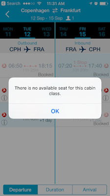
Flight booking mobile apps can get funny sometimes. They show stuff they don't have and then tell you that they don't have it. Take a look at this pearl.
I searched for Economy class flights. I told my intent at first that I am looking for Economy class. Then, why do you show me flights that do not have economy class, and guide me to select my preferred flight and then tell me that seats are not available.
Why are you showing those flights to me in the first place?
Why show stuff to users, that you don't have anyway?
Tuesday, October 3, 2017
Monday, October 2, 2017
Seat selection is a nightmare for travelers. Few airlines allow seat selection/modification at the time of check-in. Few allow travelers to select seats on the date of departure. Few disable this setting. Travelers cannot know which airline/app has configured which setting.
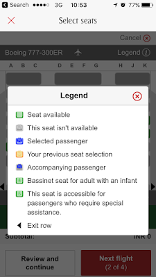
If you are lucky, you might get to choose your seat. During the process, you will see many icons as shown above, with no understanding of what they mean. Until, you find the 'i' icon or the 'Legend' icon, if you are lucky. Once you find it, you have to learn it, close this pop-up and then select the seats accordingly.
Isn't this cognitive load unnecessary? What do you think?
Friday, September 29, 2017
Pay by Card
Mobile payments are on the rise. Many apps are struggling to customize payment service providers to native mobile apps.
Take the case of Ryanair.
Firstly, it gives you an option of Card or Paypal.
Secondly, it gives you an option to type the card details or use the camera option to scan the card, which in turn automatically pre-fills the card.
Thirdly, it allows you to save the card/paypal details.
What more could one ask for?
Thursday, September 28, 2017
Email Activation Messages
Ryanair is one of the top airlines in Europe. Despite its bad reputation with customers, they continue to be profitable for the low cost carrier options they offer to travellers. The email activation message on their mobile app looks cool.
Take a look at the screenshot. It tells you you'll receive an email. It tells you which email id was it sent to. It tells you what they sent.
If this isn't good enough, what is?
Wednesday, September 27, 2017
Password Assistance
Passwords can be nasty. You start with typing the simplest password, and each time you are warned with a different error message.
GoDaddy provides the criteria upfront. As you key in the password, it provides real-time feedback if it is accepted or what is missing.
How do you guide users on strong passwords?
Tuesday, September 26, 2017
Helpful Messaging
Copenhagen Context is a popular conference in Denmark. Speakers and attendees come from across the world to attend this elite conference.
Just when people started to travel for the conference, the conference team sent out a Weather Report tweet, warning people to pack accordingly.
A tweetful tweet indeed!
Monday, September 25, 2017
Non-responsive pages on Responsive apps
Mobile web apps claim super-responsive behavior. Apps load web pages in mobile context and expect everything to work magically. In such cases, neither the app team nor the web team takes ownership for the issues, thus leading to incompatibility within the app.
The Nationality field loads very differently, while the checkbox label is truncated. The web team may claim innocence, while app team blames them or vice versa. In either case, it is the job of the entire team to take note and get it to work. The customer doesn't care which team did it. They only care if it works.
What do you care about?
Friday, September 22, 2017
Dear Uber, you are definitely not improving Uber
Uber wants to improve the lives of riders. So, they send one survey every two weeks (or every time the rider hasn't taken a ride, Uber expected them to take. And the survey form looks like this:
I am not happy with Uber because of - Driver Quality, Issues with payment/fares, High wait times to get a ride, and Surge.
Uber forces me to choose just one option.
Uber conveniently ignored the Text field for users to give subjective feedback.
Dear Uber, you are definitely not worried about improving Uber.
Are you?
Thursday, September 21, 2017
Same Book, Same Address, Overcharged Shipping
Amazon is notorious on developing markets. In India, the strategy started by not charging for shipping. Slowly, they started to charge a small fee for shipping and now, they are charging crazy shipping charges.
I ordered 3 copies of 1 book. In all probability, same dealer will ship all 3 books. In all practicality, same dealer will ship all 3 books at same time, to same address. And yet, amazon charges Rs. 40/- on each book.
What happened to common sense at all?
Wednesday, September 20, 2017
Hold On........... Construction in Progress
I was driving with few friends in Nice, France in a car, blindly following GPS. We went wherever GPS wanted us to go. During the journey, many times, we found roads to be closed, sometimes, even hitting dead ends and taking long roundabouts.
When we were fed up, we went to Google Maps. Google clearly told us which roads to take and which ones to avoid. The next few weeks, we chucked GPS and used Google.
Thank You Google!
Tuesday, September 19, 2017
Alerts
Users want multiple touchpoints to track payment related alerts. If you enable such alerts on phone, you may not receive them if you are traveling without internet data. if you enabled email option, you many not view emails at some times. The baseline - enable alerts across multiple touchpoints.
What a shame!
Monday, September 18, 2017
Offering Flexibility
Tourist visas force travelers to book accommodation in advance. Travelers often find this hard as they may need to cancel accommodations due to unforeseen emergencies. Cancellations lead to penalties which no traveler likes to pay for.
Booking.com sees this as a genuine concern for their customers. If travelers book hotels in advance, they offer a Tip - Since your dates are a while from now, pick free cancellation to stay flexible. A change of plans is a breeze when you have free cancellation!
A typical organiation may opt to exclude Free Cancellation feature as it puts a hole in the revenue. But Booking.com believes that this only makes more customers to book often and cancel less often.
Talk about building customer loyalty over years. This is one of them.
Which one are you?
Friday, September 15, 2017
Uber Pool is Not Cool
Uber pools are weird because they offer reasonable prices. Uber makes sure that passengers who pool are punished enough, so they allocate two people far far away for pooling and make them spend 2-3 hours for a 1 hour trip.
When a passenger complains of long wait+drive times for fellow passengers, Uber sends a smart message.
Hey, we noticed you rated the recent POOL trip low...................In the meantime, enjoy #PaisaVasool fares...........
Is this done? Nope.
Thursday, September 14, 2017
Not Found
Search algorithms can be quite funny, unless you are Google.
Kwench mobile app has a huge collection of hindi books. Yet, when a user searches 'Hindi books', the result is: No Results Found.
Can the app do better?
Of course, yes!
Wednesday, September 13, 2017
Bot is a Bot is a Bot
Bots are capable of doing amazing things like this one:
As you see, the bot added a non-existent item to the shopping list. How could one really order a product titled, Show me my shopping list.
Bots don't understand the meta layer of commands issued to them. They just understand THE COMMANDS.
What kind of bots are you building?
Tuesday, September 12, 2017
Marketing New Features
Product Managers want products to make money. If they have spent a bomb on a brand new feature, they have more pressure to make money quickly.
When you release a new feature, you need to market it well. Goibibo announces new features by using a bright red notification.
What if people don't use it, even then? They may not use it, but they may learn about it and that is the first step towards people using it. Eventually.
Monday, September 11, 2017
Tiny Icons
Videos are a tricky item on the internet. They are associated with multiple challenges like quality, size, and what not.
Ellen DeGeneres posted a video interview with Kim Kardashian a while ago. Spot the Play icon on the video.
Agreed that clicking anywhere on the picture plays the video. Before that, people need to know its a video. Play icon can do that.
Does the icon do its job well? May be, not!
Friday, September 8, 2017
Flight Information Display System (FIDS)
You are about to catch a flight.
You are running late.
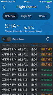
You are looking for Flight Information Display System (FIDS) to see flight status.
Except that you are at home.
What do you do?
A mobile flight booking app displays flight status on the mobile app, based on three criteria - Schedule, Flight No. and Route.
What more does a user need?
Thursday, September 7, 2017
Currency Conversion
You are traveling to a different country.
You want to choose a specific currency.
You know the name of the currency.
You do not know the symbol.
Here is what you see.
How do you choose?
Wednesday, September 6, 2017
Fare Calendars
Flights fall into expensive travel category in most countries. While searching for flights, travelers expect cheap prices and best offers.
Make My Trip offers Fare Calendar with complete price visibility for each day. Lowest prices are indicated using green color. This helps travelers looking for cheap prices.
Does your product inform travelers about cheaper options?
Tuesday, September 5, 2017
Flight Maps and Geography Settings
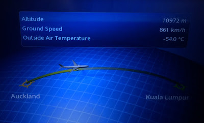
Interactive flight maps are a great way to kill time on long haul flights. Few In Flight Entertainment (IFE) systems can get the geography wrong on the maps. Take a look at this one on Malaysian Airlines.
On the world map, we know that Auckland is far far away from Kuala Lumpur to its right. On this map, representation shows that Kuala Lumpur is to the right of Auckland, and the flight is flying from Auckland to Kuala Lumpur.
As you might notice, a natural mapping is missing on the interactive map.
Mapping is a technical term meaning the relationship between two things.Consider the steering wheel in a car. To turn the car to the right, one turns the steering wheel clockwise (so that its top moves to the right). The mapping is easily learned and always remembered.
Natural mapping takes advantage of physical analogies and cultural standards (Another example - red traffic light means stop; green means go). The human mind is trained for natural mapping. As a result, products, in general, should exploit natural mapping to design enchanted experiences.
Monday, September 4, 2017
Progressive Progress Bars
Progress bars come in different designs. In mobile apps, the demand for progress bars is even high given the short attention span of users.
One mobile app decided to offer 3 progress indicators rolled into one.
A progress bar, a loading icon and a contextual message, 'Sending link...' appear to offer a consolation to the user. Instead, the user is confused with confusing jargon and rolling gif files.
Quoting John Maeda:
"When speeding-up a process is not an option, giving extra care to a customer makes the experience of waiting more tolerable. I appreciate the free cookies and other samples in line at the Whole Foods store during the Thanksgiving season as the checkout queue snakes across the entire store. Saving time is thus the trade-off between the quantitatively fast versus the qualitatively fast."The focus of loading indicators should be more on the progress rather than making wait times longer and intolerable.
Monday, August 14, 2017
Free Wi-Fi
Wi-Fi has transformed from a luxury option to a necessary option.
Do you want more passengers to choose your airlines? Offer free wi-fi onboard.
Do you want more people to travel by train? Offer free wi-fi at stations.
Indian Railways, one of the most profitable railways in the world has introduced free wi-fi in many railway stations.
Do you offer free wi-fi?
Wednesday, July 19, 2017
Best Products at Cheaper Prices
E-commerce websites can be quite funny across different countries. eBay website for India displays Sort feature for the time, price and distance. Additional options like Price: lowest first, Price: highest first offer more and better choices to users.
Where is Low to High filter? Do french people don't like cheap stuff? Was this option removed based on data from usage analytics? If analytics was used to remove the option, then it is a good thing. But if the sort filters team across countries didn't talk to each other and landed up in this difference, it is not a good thing.
Let's face it. We all like stuff that costs cheaper. We want the best products, but at cheaper prices. This is partly the reason why the e-Commerce price wars never seem to end.
While it is good to customize sort filters based on country, e-commerce websites must keep in mind that buying patterns may change from country to country, but buying mindset remains the same"
Best Products at Cheaper Prices.
How does your website fare in different countries?
Tuesday, July 18, 2017
Drop the Dropdowns
An online e-commerce application wanted to grant freedom of choice to its customers for online payment. This is how the ocean of options looked like, for a netbanking shopper:
Do customers admire such a freedom of choice? I am afraid, not.
If you are a regular online shopper and use netbanking as a payment option, there is a high probability that you have 3-5 accounts (perhaps?) to pay from. You wouldn't have 40+ online bank accounts with 40+ banks as depicted in the dropdown.
Dropdowns are the most mis-used UI components in the history of software products, in the name of giving freedom and control for users.
An ideal way to handle this situation is to remember the top 3-5 banks the user frequently uses and just show them, while offering the flexibility to modify existing list. Some of you may cry about too many clicks or taps, but what use is such a huge page where you have to spend few minutes to locate your bank name?
Too much of a choice is not a good choice.
What do your customers choose from?
Monday, July 17, 2017
Do Not Use Lift In Event of Fire
Helpful messages are helpful, especially when they show up in helpless situations. You are stuck in a lift. There is a fire accident and then you see this signage inside the lift. The signage says, Do not use lift in event of fire. It's a decent message. Fair enough.
BUT...
What use is this signage for someone inside the lift? What can the person do to get out of the lift safely? Can he save himself, solely based on the advice in this signage?
Of course, not!
Forgiving designs note that people might be caught in unwarranted situations and advise accordingly.
How forgiving are your designs?
Subscribe to:
Posts (Atom)


