Pages

Monday, March 13, 2017

Frequent Behavior


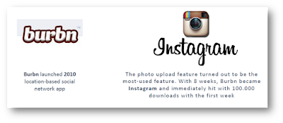
In 2010, a location-based social networking app called Burbn was launched. A few days later, the creators noticed that the photo upload feature turned out to be the most-used feature. Within 8 weeks, Burbn became Instagram and hit 100,000 downloads within the first week.

Few features are so frequently used that they become products in themselves. Instagram is one such story. The 'Fast Cash' feature or 'Add to Favorites' features are great examples of transforming frequent behaviors to full-fledged product features.


Thursday, March 9, 2017

The Oscar Night and the Mishap


Oscars is a big deal. Just when it was ending on a happy note, a major mishap spoiled the historic show's reputation at Oscars 2017. A wrong winner was declared in the 'Best Picture' category naming La La Land instead of Moonlight which was the real winner. Although the producers of La La Land graciously handed over the trophies to Moonlight team, it was embarrassing for many artists for sure. 

What went wrong? 


The card design, content presentation and typography went wrong. Benjamin Bannister redesigned the card to reflect necessary and important information that may have avoided the mishap.

Some lessons are expensive!


Wednesday, March 8, 2017

Magnetic Doors


How many times have you banged the restroom door, leaving too much of noise behind?


This door has a magnetic strip on the rim of the door. When a user bangs the door, the magnet locks the door without banging to and fro, thus preventing noise.


Tuesday, March 7, 2017

Google's Toothbrush Test


Google's Toothbrush Test

Google's Larry Page insists that new products or services must be important enough that people will use them at least twice a day. 

Google Search? More than twice a day.

Twitter? More than twice a day.

Facebook? Many times in a day.

Does your product pass the toothbrush test?


Sunday, March 5, 2017

If You Only Have Time to Do One Thing...


You are reading a robust book on a deep subject. Some chapters are interesting. Some are not. You scan through many pages. You skim through others. Sometimes, you drill down to the summary of each chapter by skipping the chapter itself. You know what? Even summary section is boring.


Leah Buley introduces a section called 'If You Only Do One Thing...' It appears, she means that even if you didn't read the whole chapter, even if you didn't like all the methods, you might want to look up this section called 'Guerrilla User Research' because that is a powerful concept. 

What a lovely way to nudge people!

Friday, March 3, 2017

How Far Are You from Finishing the Book?


More often, you wonder how many pages are left in the book as you read the book - a hard binding or an ebook. 


Another one here.


Leah Buley, author of  the book The User Experience Team of One and used an intuitive way of telling the user where the user is, at the beginning of each chapter and how much of the book is left to be read. 

Thursday, March 2, 2017

UX is NOT EQUAL to UI


This was originally published on Linked In.

Excerpts from the book, The Best Interface is No Interface.

This is UI:
Navigation, subnavigation, menus, drop-downs, buttons, links, windows, rounded corners, shadowing, error messages, alerts, updates, checkboxes, password fields, search fields, text inputs, radio selections, text areas, hover states, selection states, pressed states, tooltips, banner ads, embedded videos, swipe animations, scrolling, clicking, iconography, colors, lists, slideshows, alt text, badges, notifications, gradients, pop-ups, carousels, OK/Cancel, etc. etc. etc.

This is UX:
People, happiness, solving problems, understanding needs, love, efficiency, entertainment, pleasure, delight, smiles, soul, warmth, personality, joy, satisfaction, gratification, elation, exhilaration, bliss, euphoria, convenience, enchantment, magic, productivity, effectiveness, etc. etc. etc.

Somewhere along the way, we confused the two. And instead of pursuing the best, most creative, inventive, and useful ways to solve a problem, we started solving problems with screens because that was our job description. When we saw problems, we slapped an interface on it. UX stopped being about people, and started being about rounded rectangles and parallax animations.

It’s gotten to the point where many of our greatest minds aren’t being pushed into advancing science or taking us into space; they’re working at the new screen-based megacorporations that have surpassed oil companies in profits and political influence. They’re cranking out glorified digital billboards masked as websites and apps that are trying to monetize your eyeballs by pushing creepy ads onto all of your screens.

In the words of Jeff Hammerbacher, a former manager at Facebook and the founder of Cloudera, “The best minds of my generation are thinking about how to make people click ads. That sucks.”

"There’s a better path. There’s a better way of thinking. When we separate the two roles, we can start defining new, better experiences."Golden Krishna

Related Post
User Experience Design != Visual Design