Pages

Friday, January 27, 2017

Make Frequent Behavior as the Default Behavior


Many people withdraw cash at regular intervals of time. Once in a week, twice in a fortnight or even many times in the month. Some people withdraw specific amount of money from time to time and withdrawal is their only reason to visit the ATM. 

Why should the user go through the regular drill of entering the pin, selecting Withdrawal > Select Account Type > Select Amount > Confirm, and the pain of crawling through 5-6 screens to get to the amount. 

Can we reduce this to two steps: 1. Enter PIN 2. Fast Cash Withdrawal?

Yes. We can.


Image result for hdfc atm screen
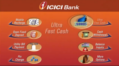
Ultra Fast Cash from ICICI Bank

ICICI bank implemented Ultra Fast Cash feature wherein user sees this option as soon as he enters the valid PIN details. Tapping on it lets you withdraw cash very quickly. In subsequent transactions, if user changes the amount, an option 'Set as favorite' is displayed at the end of the transaction enabling the system to remember your recent selection for next visit to ATM.

Notice frequent behaviors of users. Notice how they struggle through. Ask yourself if that can be simplified, if frequent behavior can become the default behavior.

Tuesday, January 24, 2017

Micro-Moments


Suppose you are on a leaky network connection and call one of your old friends whose number is not stored on your phone contact book.

How do you call that friend?

You select the contact on WhatsApp and call. Simple. Isn't it?

Perhaps not.

Here is what happens:
Calling a contact from Whatsapp

Plausible Suggestions
1. Can we replace above steps with a single 'Call' option which lets you select 'Whatsapp' or 'Phone' contacts? Yes, we can.

2. Even better, can we allow the phone to automatically detect leaky network and call from phone? Yes, we can.

3. For international calls, can we let the phone to warn the user before calling from phone book and charge the caller? Yes, we can.

So, a giant number of steps can be thought through to reduce it to fewer steps. This is called a microinteraction. 

"A microinteraction is a contained product moment that does one task well."

Can you think of a problem, that is starved of microinteractions?


Sunday, January 22, 2017

Input Mask


Have you ever wondered how to input data in date of birth field, phone number field, credit/debit cards, country+area codes amongst others? The format might be specified as a placeholder which disappears if user places a cursor on the field. Support text below the field eats into screen real estate. So, what is the best way to display format and guide the user correctly? 


Input Mask

Input Mask is the answer. If user attempts to reset a password on apple website, user is asked to enter data in specific format dd/mm/yyyy. As user enters values, each letter disappears providing a visual cue. 

"Input Masks reduce input errors and also guide users to input data in the right format."

Thursday, January 19, 2017

User Wait Time


Traditional folklore suggests that if we keep users waiting, we must let them know:

  • It will take a while
  • They need to be patient as they wait

Loading indicators were, hence, born. As this trend caught up, developers and designers put their blood and sweat into developing the 'Next Best Progress Bar/ Spinner Of The Year' elements. And then, we had a bunch of innovative items. Google 'Best Loading Icon' and see it for yourself. While design and functionality of these icons was good, they failed to fulfill the fundamental need of 'waiting'. Looking at these icons only made users feel that time is moving even slower than before. The purpose of ‘progress’ was lost!


Hipmunk app using wait times by displaying 'Fare Alerts' to users 


How do we solve the User Wait Problem?
While relevant flight results are loaded, Hipmunk introduces an existing feature, ‘Fare Alerts’ wherein user is asked to subscribe to free fare alerts. An assuring statement, ‘This will not interfere with your search.’ is displayed, just in case user fears that his search operation will be abandoned. If user taps on ‘Subscribe to this alert’ button, the button is replaced by ‘Adding fare alert…', followed by ‘Fare alert added!’ message. Throughout this activity, Hipmunk’s maskot dances on the screen, hinting that flight search results are on their way. This is a classic usage of channeling frustrating wait times to positive experiences.

"The focus of loading indicators should be more on the progress rather than making wait times longer and intolerable."

Friday, January 13, 2017

Welcome to Mindful User Experiences!


Hi There,


Welcome to Mindful User Experiences website! My name is Parimala Hariprasad. I am an aspiring UX Alchemist and I love everything concerned with Flying, User Experience and Mobile. I have been blogging since 2009 on different platforms here and here. Someday, I hoped to have my own space in User Experience where I can share delightful stories of great user experiences while educating people about painful experiences and how to make them better. YOU, are welcome to join me on this exciting journey in 2017.


Watch this space!