Pages

Tuesday, September 5, 2017

Flight Maps and Geography Settings


Interactive flight maps are a great way to kill time on long haul flights. Few In Flight Entertainment (IFE) systems can get the geography wrong on the maps. Take a look at this one on Malaysian Airlines.
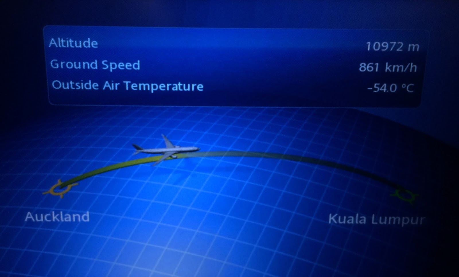

On the world map, we know that Auckland is far far away from Kuala Lumpur to its right. On this map, representation shows that Kuala Lumpur is to the right of Auckland, and the flight is flying from Auckland to Kuala Lumpur. 

As you might notice, a natural mapping is missing on the interactive map. 
Mapping is a technical term meaning the relationship between two things.
Consider the steering wheel in a car. To turn the car to the right, one turns the steering wheel clockwise (so that its top moves to the right). The mapping is easily learned and always remembered.

Natural mapping takes advantage of physical analogies and cultural standards (Another example - red traffic light means stop; green means go). The human mind is trained for natural mapping. As a result, products, in general, should exploit natural mapping to design enchanted experiences.

Monday, September 4, 2017

Progressive Progress Bars


Progress bars come in different designs. In mobile apps, the demand for progress bars is even high given the short attention span of users.

One mobile app decided to offer 3 progress indicators rolled into one.


A progress bar, a loading icon and a contextual message, 'Sending link...' appear to offer a consolation to the user. Instead, the user is confused with confusing jargon and rolling gif files.


Quoting John Maeda:


"When speeding-up a process is not an option, giving extra care to a customer makes the experience of waiting more tolerable. I appreciate the free cookies and other samples in line at the Whole Foods store during the Thanksgiving season as the checkout queue snakes across the entire store. Saving time is thus the trade-off between the quantitatively fast versus the qualitatively fast."
The focus of loading indicators should be more on the progress rather than making wait times longer and intolerable. 

Monday, August 14, 2017

Free Wi-Fi


Wi-Fi has transformed from a luxury option to a necessary option.

Do you want more passengers to choose your airlines? Offer free wi-fi onboard.

Do you want more people to travel by train? Offer free wi-fi at stations.


Indian Railways, one of the most profitable railways in the world has introduced free wi-fi in many railway stations.

Do you offer free wi-fi?


Wednesday, July 19, 2017

Best Products at Cheaper Prices


E-commerce websites can be quite funny across different countries. eBay website for India displays Sort feature for the time, price and distance. Additional options like Price: lowest first, Price: highest first offer more and better choices to users.

Let's look at the website for France. The Sort feature doesn't cover many options available for India.
Where is Low to High filter? Do french people don't like cheap stuff? Was this option removed based on data from usage analytics? If analytics was used to remove the option, then it is a good thing. But if the sort filters team across countries didn't talk to each other and landed up in this difference, it is not a good thing.

Let's face it. We all like stuff that costs cheaper. We want the best products, but at cheaper prices. This is partly the reason why the e-Commerce price wars never seem to end.

While it is good to customize sort filters based on country, e-commerce websites must keep in mind that buying patterns may change from country to country, but buying mindset remains the same"
Best Products at Cheaper Prices.
How does your website fare in different countries?


Tuesday, July 18, 2017

Drop the Dropdowns


An online e-commerce application wanted to grant freedom of choice to its customers for online payment. This is how the ocean of options looked like, for a netbanking shopper:

Do customers admire such a freedom of choice? I am afraid, not.

If you are a regular online shopper and use netbanking as a payment option, there is a high probability that you have 3-5 accounts (perhaps?) to pay from. You wouldn't have 40+ online bank accounts with 40+ banks as depicted in the dropdown.

Dropdowns are the most mis-used UI components in the history of software products, in the name of giving freedom and control for users. 

An ideal way to handle this situation is to remember the top 3-5 banks the user frequently uses and just show them, while offering the flexibility to modify existing list. Some of you may cry about too many clicks or taps, but what use is such a huge page where you have to spend few minutes to locate your bank name?

Too much of a choice is not a good choice.

What do your customers choose from?

Monday, July 17, 2017

Do Not Use Lift In Event of Fire


Helpful messages are helpful, especially when they show up in helpless situations. You are stuck in a lift. There is a fire accident and then you see this signage inside the lift. The signage says, Do not use lift in event of fire. It's a decent message. Fair enough.


BUT...

What use is this signage for someone inside the lift? What can the person do to get out of the lift safely? Can he save himself, solely based on the advice in this signage? 

Of course, not!

Forgiving designs note that people might be caught in unwarranted situations and advise accordingly.

How forgiving are your designs?